Drupal is a powerful CMS under the hood but i get a lot of complaints from clients why the content editing kinda sucks. These clients are primarily content editors. Sadly, i do feel they have a good point and Drupal really needs to improve in this area.
To be fair, Drupal 8 has already made some good improvements. It may seem like small changes to the UI but these small changes makes the world of a difference already.
Having said that, of course there is still plenty of room for improvement and a large chunk of resource from Acquia has been spent on creating a better user experience.
Currently, what i don't like is the use of the admin menu. You have to click on a menu item and then click on another menu item just to get to where you want. It just seems so tedious to say the least. Of course, there is a module called Admin menu (D7 version and D8 version) which adds a dropdown menu and i have to say, it does add some improvement but still fall short of being usable on touch screens or when the dropdown list becomes too long.
Here is what Drupal 7 looks like (with overlay)
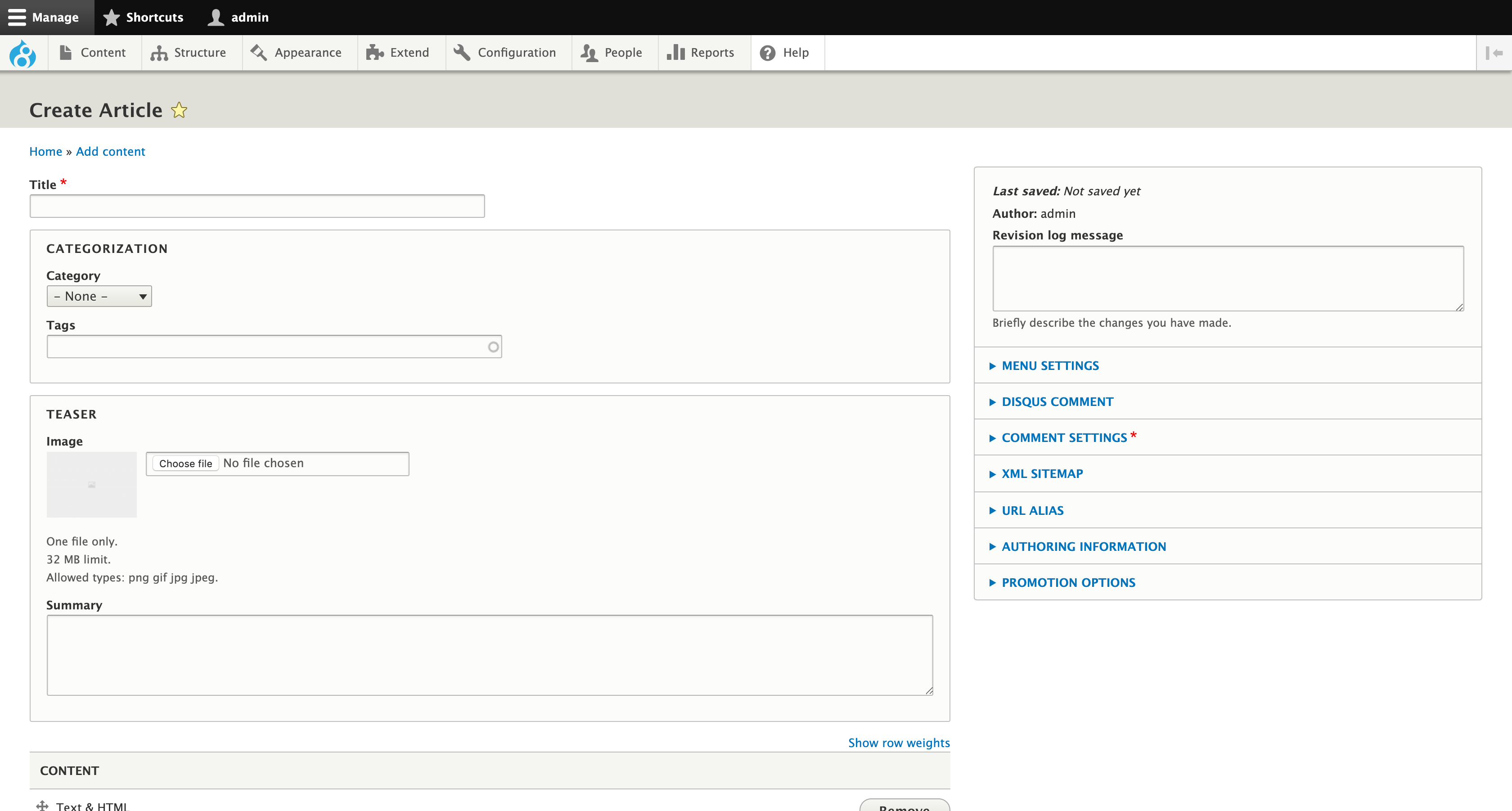
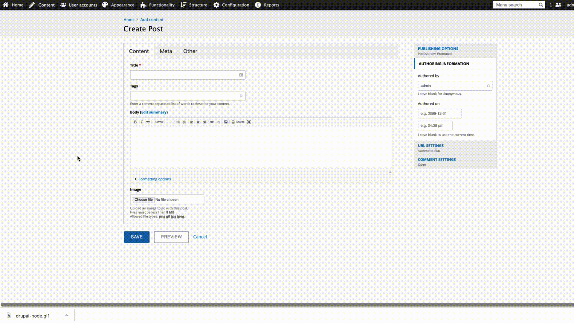
Drupal 8
I think Backdrop CMS fails where Drupal 8 surpassed it and there are no excuse for Backdrop to not make improvements to their UI (I included Backdrop CMS because this is a fork of Drupal 7).
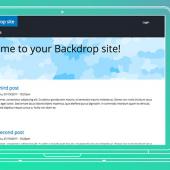
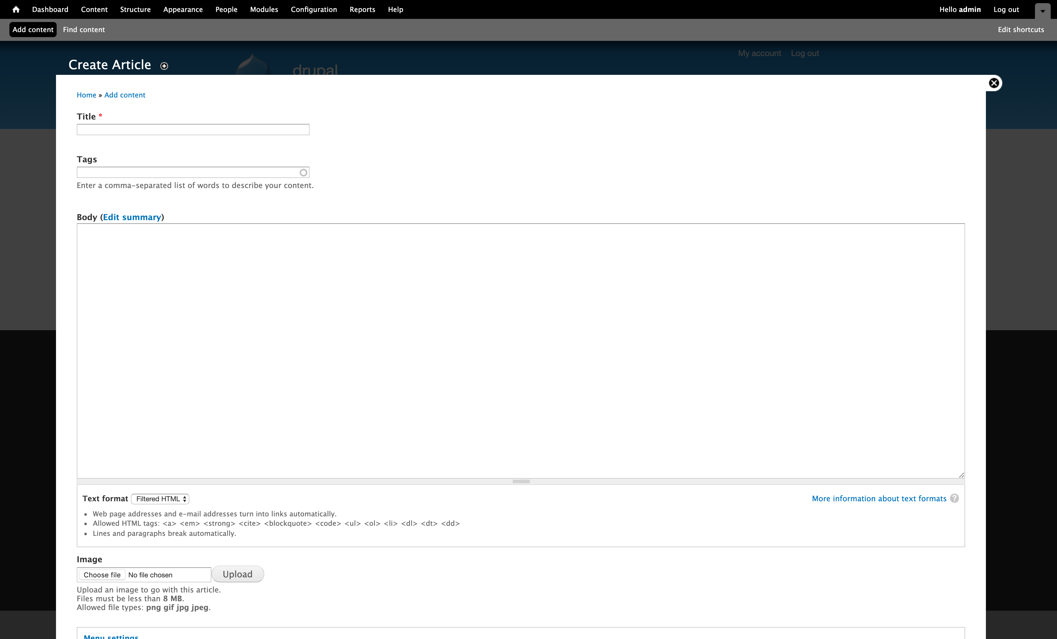
Here is Backdrop (nothing has change, same old Drupal 7 content editing UI but only difference is overlay removed by default. This can also be disabled in Drupal 7).
The problem with Drupal content editing UI is that as soon as you add more fields to the form, it becomes one big ever scrolling form on the page. It was worst in Drupal 6 before the introduction of vertical tabs in Drupal 7 which neatly kept some features in a vertical tab to reduce the page scroll. But it didn't go far enough.
Drupal 8 went one step further and improved on this by splitting it up and putting some of the features into a sidebar. Sadly, Backdrop cms hasn't evolved in this area.
These incremental changes has shown us that Drupal do take UX seriously and putting a lot of effort into it.
I think the next step should be improving on the admin menu and here's my take on it.
We should introduce an off canvas sub menu for quicker access to pages that are buried couple of levels below. Each menu item should have an info icon so users can quickly find out what the page is without having to go directly there find out and saving time. The whole point is to make content editors more productive.
In some cases, the off-canvas menu may get too long with many menu items. If that happens, then an auto scrollbar should be present to allow the user to scroll thru the list.
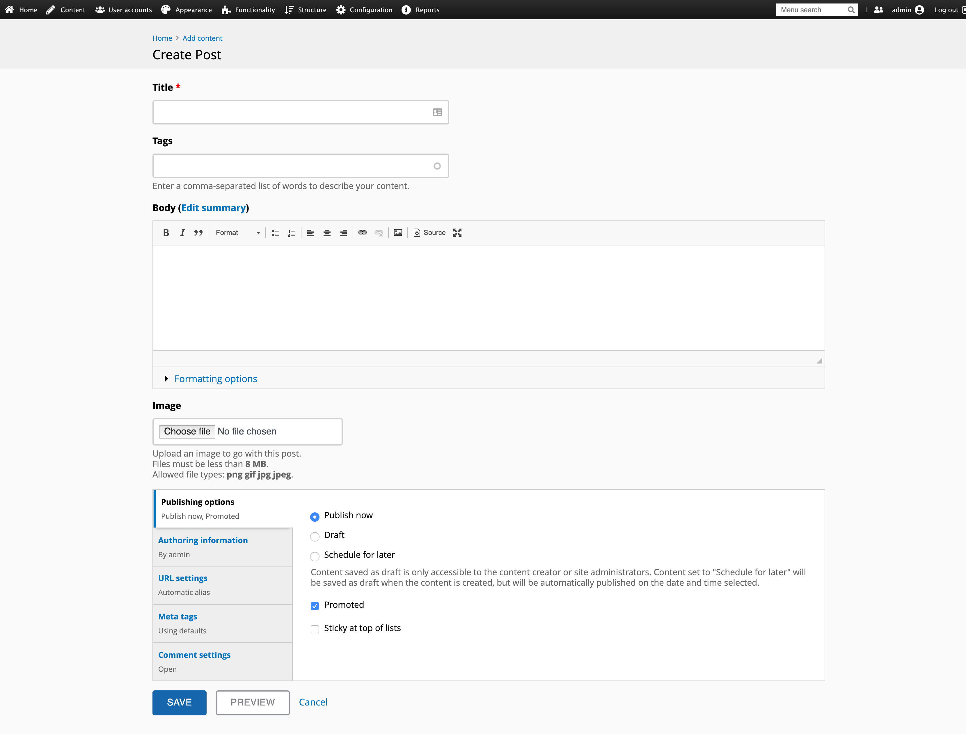
I added tabs to split the form into sections so it does not become one big long scrolling page.
Another thing, the off canvas sub menu does not get in the way when you are doing some frontend editing.
To see how my new improve editing content UI i've re-imagined, here is an example (it is not a working product, just a quick mockup):
If i ever fork Drupal 7, i would want my editing content experience to be like this and some of my clients agreed too. I'll leave the forking for another article.