Right now, on your site, a handful of usability mistakes could be hacking and slashing away at your conversion rates and sales.
Fortunately, there is a lot of research and eye-tracking tests we can reference , and today you're going to get these insightful studies served up in laymen's terms, allowing you to incorporate their findings into your site's design and interface.
You'll see how seemingly minor aspects of your website can be huge determinants of how well your business performs.
1. Fast websites are used, slow websites are abandoned
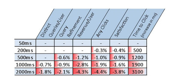
You've likely heard this one before -- website speed is critical for sales because people are impatient. But do you know how far this effect really goes? According to a joint analysis from by Google's search team and the Microsoft Bing team, page speed is a huge factor in a number of important statistics:
A less than 2-second increased delay in page responsiveness reduced user satisfaction by 3.8%, lost revenue per user of 4.3% and reduced clicks by 4.4%.
Users really are impatient, and your punishment for a slow-loading website won't be complaints in your inbox, it will be lost sales from people who decided what you were selling wasn't worth the wait. Remember: when it doubt, cut it out.
If you also take into consideration that Google may rank pages based on their speed, what you are left with is a clear warning that you need to have a seriously fast website if you want your business to grow into the big leagues.
2. If it's important, it should be obvious
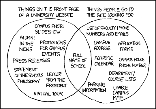
While it's not necessary to keep every little thing "above the fold," it is important to create a site that correctly prioritizes key pages.
In a humorous take on doing this wrong, xkcd's Randall Monroe points out how miserable it is to browse most university's homepages:
In a common example, think back to a time that you visited a restaurant homepage that didn't have their hours listed or that hid the phone number for reservations all the way at the bottom of the page.
Try viewing your site from a customer's perspective, and apply the KISS principle to avoid clutter and needless navigation.
3. No emphasis on headlines
According to the Eyetrack III study, headlines are the most viewed thing on any page, even more so than flashy images. Here are some interesting stats on the power of headlines:
- Headlines draw people's attention almost immediately, and outperform pictures by a large margin.
- People scan only the first couple of words in a headline before they make their decision to leave or stay.
- Your headline has approximately ~1 second to capture a reader's attention before being ignored.
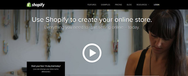
Why this is important: You're sabotaging your sales if the major pages on your site don't have great headlines telling customers exactly what the page is about. Here's a good example from Shopify.
It's especially important to use clear and concise headlines on your product pages page, which is one of the most important destinations for interested customers.
Last but not least, important "explainer" pages (outside of your homepage) also need to include a powerful headline to get the message broadcast clearly. This can include pages like your testimonial page to your benefits page that gives customers a reason to stick around.
Potential customers should immediately be confronted with the point of the page, as you have little time before you lose their interest and the sale.
4. Not designing based on reading patterns
The way we read dictates much of how we browse a website, because more often than not, a majority of a website is going to consist of written content.
You might have seen the eye-tracking study that revealed our tendency to browse in an F-pattern:
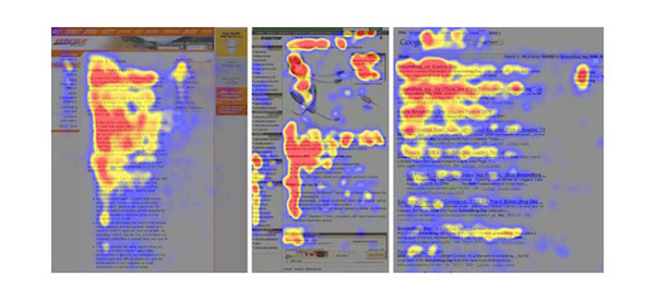
It's been found to be true across all sorts of content pages, from blog posts to search engine results. We tend to favour browsing in an F-pattern that leans heavily to the left side of the screen.
This is largely due to our reading patterns, and the results don't end there.
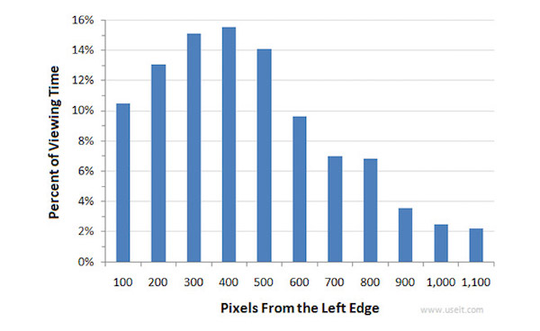
According to a separate study, many web users spend a majority of their attention on the left side of a web page -- as much as 69% of the time.
If your site has an interface that customers will be interacting with regularly, this is an important study to keep in the back of your mind when you're split-testing different elements of your site.
Important note: the study found that the opposite is true for those users who read in a language where the text is consumed from right to left.
This shows that we truly seem to browse pages based on reading patterns, but it also brings up the point that you need to take your audience into account when analyzing any of these studies.
5. Forgetting to create a visual hierarchy with color
The argument over which color is best for conversions is a silly one.
Red, orange, green--there's never a consensus. A color's ability to affect conversions has far more to do with context than the color itself. This statement is supported by cognitive research, specifically a phenomenon known as the Von Restorff effect. In layman's terms, the effect predicts that whatever stands out gets recognized and easily recalled, and what blends in gets ignored.
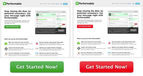
So when you come across A/B tests like this one from Joshua Porter, you should recognize that one color only outperforms the other because it stands out. He
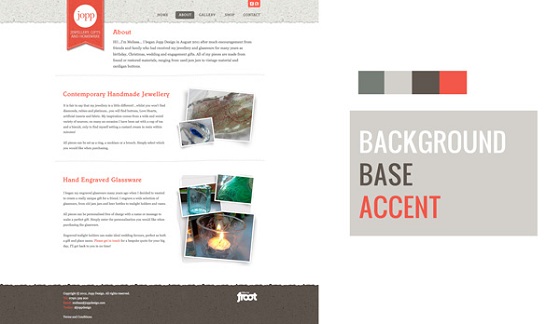
It's better to create a visual hierarchy for your site, as explained by StudioPress and illustrated below by Josh Byers. You can utilize "action colors" to denote when a customer should click, allowing you to distinguish your important buttons and links from your unimportant ones.
6. Not incorporating directional cues
According to results from the appropriately titled study "Eye gaze cannot be ignored (but neither can arrows)," we cannot resist following the line of sight of both another person's gaze or a directional arrow.
Consider the results from the test below, which uses a photograph of a baby next to some body copy:
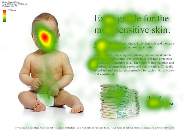
You'll notice that your gaze naturally focuses on the baby's face; in fact, it dominates viewing time and is easily the most viewed item on the page.
The next test used a picture of the baby looking in the direction of the text:
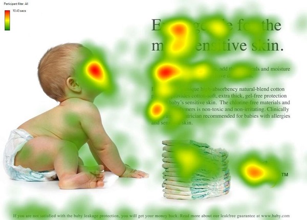
Now we can see that the face initially attracts the eye, but then our attention shifts over to where the baby is looking. If you can't incorporate a human face into your web design, remember that directional arrows and other visual cues also worked quite well!
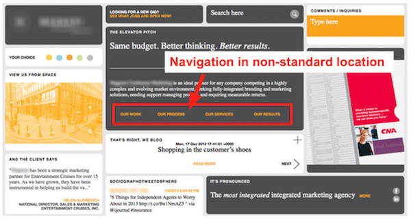
7. Confusing navigation
Navigation is one of those things you must get right, as it's likely the next place a user will look after they view your headline.
Some companies, however, just can't seem to get navigation right. They put them in the wrong place, make them too generic to figure out, or include far too many options.
According to this test involving site design, over 70% of users went for a link to click rather than using search.
That coincides with another study that shows that users use search only when they can't find what they're looking for, meaning that you shouldn't rely on search as a crutch.
Make sure that the navigation on your site is in an area where people expect it, is obvious and clear in communicating where each links goes, and contains enough links to navigate to the important parts of your site but doesn't go overboard.
8. Relying on the "3-click" rule
There is an unfortunate misconception out there among some UX designers that if it takes a user more than 3 clicks to do something, they'll become overly frustrated.
While this makes sense logically, and web users don't want to have to click around too much to complete a task, sticking to an arbitrary rule with no data to support it is not the way to go.
As it turns out, most users will not give up on something just because they've hit the magical "3-click" ceiling, and I've got research to prove it.
A study conducted by Joshua Porter published on User Interface Engineering found that users aren't more likely to resign to failure after 3 clicks versus a higher number such as 12 clicks. "Hardly anybody gave up after 3 clicks," Porter concluded.
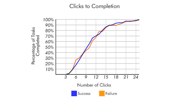
The focus shouldn't be on decreasing clicks to a specific number, but rather on analyzing the ease of utility. Just because something takes 7 clicks instead of 3 doesn't mean your users will hate it. It's the end goal that matters.
9. Bad spacing on long landing pages
As Neil Patel concluded in an interesting case study, long landing pages definitely can be a good thing: They actually tend to be more persuasive, as you have more time to make your case.
The length of the page brings in more qualified leads, as those people have taken the time to read 1000+ words. The problem, however, is one that many people instinctively know, and that the data supports. The longer the page, the fewer people stick around. Take a look at this research from the Nielsen Norman Group.
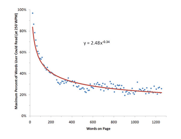
This creates a dilemma: If longer landing pages can be useful and bring in more qualified leads, but people tend to hate reading "wall-of-text" content, what can marketers do?
The answer, according to Copyblogger's lead designer Rafal Tomal, is to focus on content "chunking" by utilizing sub-headings and better spacing on long landing pages. Take a look at the comparison below:
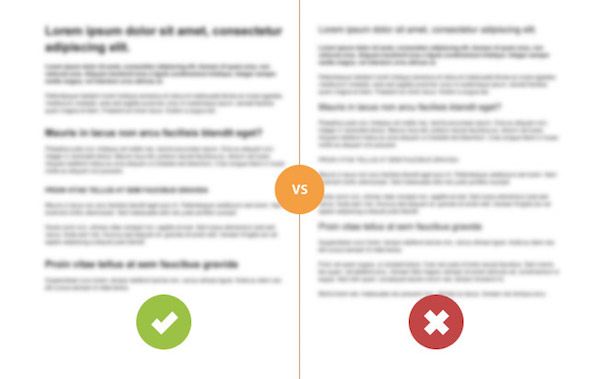
This way, longer content becomes less intimidating and far more scannable, resulting in long landing pages that actually will get read.
Article taken from Inc.com