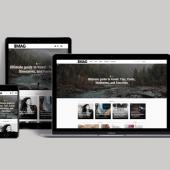
Duvien.com - site redesigned
There are a lot of good reasons why designers and developers should use a framework that is well supported. It helps to ease the development and eliminate any repetitive tasks and to keep everything consistent within the design or your code.
I chose Blueprint simply because it was developed and written by a group who were inspired by some of the industry leading developers (such as Eric Meyer and Jeff Croft, to name a few). So what is Blueprint (BP)? it is a CSS framework that is built to use the grid column system layout and good use of typography.
These are the essentials for any magazine, publication or newspaper layout and design as it helps to order the aesthetics of a page and for readability. Apply this to a website and you will have a nice orderly, clean and usable site.
The next step would be how to position the contents in such a way that it would be easy for your visitors to find what they want or at least what you think is most important to them. As of writing, i'm using BP version 0.7.1. The package comes bundled with examples, libraries, plugins and many CSS files. I wouldn't go into details about it as i only used the CSS files and the library files seems to be some Ruby On Rails scripts.
The plugins are additional options for for adding some neat CSS styling to your site, though the only thing in the folder was 'fancy fonts' at this time (here's an example in used: About Duvien). I'm guessing more plugins will be added at a later date. Each CSS is separated into it's own file for maintainability which is quite nice. But if you prefer there is a file called screen.css which includes all the other CSS files.
This is what i have chosen to use since i felt all the files were necessary. These files are: forms.css, grid.css, typography.css and reset.css but all lumped into screen.css which i used. There are other files that had to be included, but in your HTML document, these are ie.css (there's getting away from this one, buggy IE) and print for print layout of your page.
This CSS BluePrint was to be used for my new Drupal theme as it is currently the CMF (Content Management Framework) i am using to power this site. Just a side note, if you have not yet tried out Drupal, do so now. It may take some time to learn but it's fun and worth it as you begin to unleash the power. Hang on in theere as there are many goodness to come.
The development of Drupal has suddenly taken huge momentum to improve on an already superb system. Not sure if Acquia has anything to do with this but nevertheless it's an advantage for the community so long as everyone chip in too.
Back to BluePrint, anyway during building the site, i ran into some issues which caused some of the paragraphs and list items to look out of alignment but on further inspection i cannot blame BP for this as Drupal itself has a lot of core CSS files which must have clashed. Removing some of the styling clash, everything was ironed out quite nicely. I have to also point out the reset.css that was suppose to help reset all your styling for different browsers didn't really work as well as it should. And some elements had to be removed. The ie.css was great but i still had to add a few more classes and IDs to it but this is more targeting some CSS used in Drupal.
The best thing i like about this BP was the grid.css. This wonderful piece of CSS helped to lay your site into orderly clean and uncluttered columns which is very flexible and allows for laying out many different columns as you fancy. Not only that but each column CSS classes is measured out for you and you only need to work out what page size you want to use and how many columns you want to include. For example, on this site i chose a three column layout and wanted the main content area to be the wider than the other two.
The page was to be 950px in width and i needed some nice spacing between the columns to keep it tidy. By looking through the grid.css file i was able to quickly work out how many pixels i need for the main content area and the two sidebar columns, including the spaces between each column to keep the total page size to 950px. so the CSS classes i used were: .span-14 .colborder .span-9 .last In the grid.css there are more CSS classes that define different pixel size for the width of your box, by using a combination of these depending on the layout you want it should help you balance the total without needing to work them out from scratch.
Furthermore, there is an image file which can be included for the background while testing your layout. The image creates a grid so you can see the alignment of your page, pretty neat. While on this topic, there is another way to achieve this, use GridFox ;) Why do you think every Web designer urges everyone to use Firefox. Forgot to mention the .last CSS class is used for clearing the floats, i think. There is a quick tutorial that covers most of what i have explained.
Did i like it? hard question, yes and no. Yes, because it did quicken up the process for me to devleop my site and no, because i ended up having to remove quite a lot of the styling for the properties of the elements which i knew was expected depending on the layout but did not realise i had to remove more than i had expected. Maybe, part of the reason is to do with Drupal's internal CSS files.
However, it would be interesting to use this Blueprint again on another project soon. Well, I also just found out there is another CSS framework called Boilerplate. This one claims to be a stripped down version of Blueprint and is built to be more semantic in it's naming conventions for CSS. Maybe, i might just try this out instead?. Having said that, i know there are probably still a few things on this site to fix but that'll do for today. It's my own site so there's no rush for it :)
Overall, it had been fun using BluePrint but hoped that i didn't have to put too much effort into it. But hey, no framework is perfect and i admired the attempt to create one. Quick note before i leave you, if you have installed 'Printer-Friendly Pages' module, be sure to change the custom stylesheet URL to point to the BluePrint print.css file (should be in your theme folder). You can set this in your printer-friendly page settings.


